
7 tips for high-converting real estate landing pages (+ examples that work)
Vetted by HousingWire | Our editors independently review the products we recommend. When you buy through our links, we may earn a commission.
As a professional marketer, your real estate landing pages are one of your most valuable lead generation assets. Get them right, and your ROI from paid leads will soar. Get them wrong, and your leads will head right back to Zillow.
To help, we’re giving you seven deceptively simple tips we’ve used to convert thousands of leads on landing pages. After the tips, we break down eight high-converting landing pages to explain why they work and give you actionable takeaways to start converting more leads today.
Summary
What are real estate landing pages?
Real estate landing pages are web pages that use UX and copywriting techniques to persuade someone to take a specific action. Most landing pages include a compelling offer and ask for a buyer or seller’s contact information in return. The goal is simple but not easy: convert site visitors into leads.
Common landing page offers include:
- An instant or in-person home valuation
- A lead magnet (buyer or seller guides, off-market listings)
- A seller consultation
- A buyer consultation
- A cash offer for a home
- An RSVP for an open house
9 high-converting real estate landing pages + why they work
Let’s look at a few examples of high-converting real estate landing pages to break down why they work and how you can “borrow” their strategies to increase conversions on your own pages. These examples have been extensively tested and refined by professional marketers to maximize conversion rates.
Seller lead landing pages
The classic “sell with us” landing pages are a mainstay of every real estate website and one of the best ways to generate seller leads online. These examples use clever copy, simple graphic design, and emotionally compelling messaging to increase conversions:
Corcoran
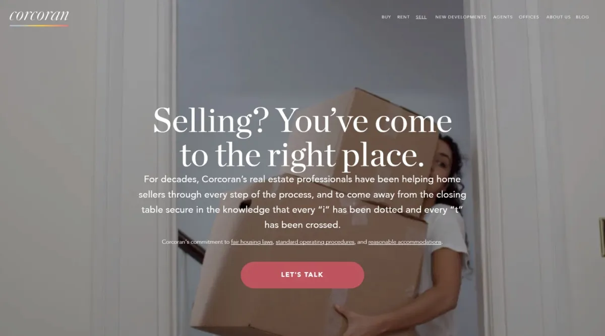
Why it’s so effective: This custom seller landing page leverages clever copy and imagery that empathizes with a common seller pain point – the stress of moving — an effective way to highlight one of the main benefits of working with a listing agent.
Key takeaways:
- A friendly CTA: “Let’s talk” subtly reminds people that the next step is a conversion with a caring and empathetic expert who can help solve their problem
- Use pleasing and complementary button colors: The soft terracotta pink of this button is on-trend and doesn’t scream pushy salesperson
- Create a visual hierarchy that leads to your CTA button: The headline and body copy are centered and lead directly to the CTA button. Clicking feels like the natural thing to do after reading
Shore Living

Why it’s so effective: On-trend graphic design is an ideal way to show off your marketing chops to millennial homeowners (and the boomers who envy them). Soft pastel colors and an elegant serif font hint that you have a sense of style — crucial for marketing homes in the social media era.
Key takeaways:
- Use a custom headline: “Partner with a Realtor who gets it” is far more compelling than the bog standard “sell with us” every other agent uses.
- Give them a way to call you: The click-to-call feature lets people call you directly. Even if they don’t use it, it shows you are making yourself available.
- Clear, direct CTA button copy: Make it clear what will happen after they click the button.
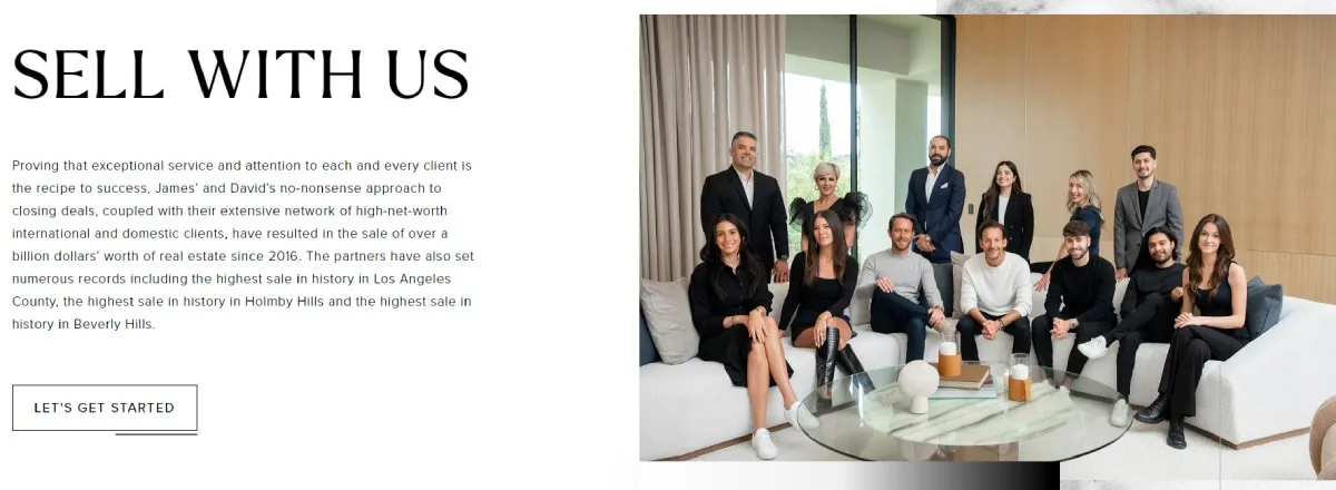
Bond Street Partners
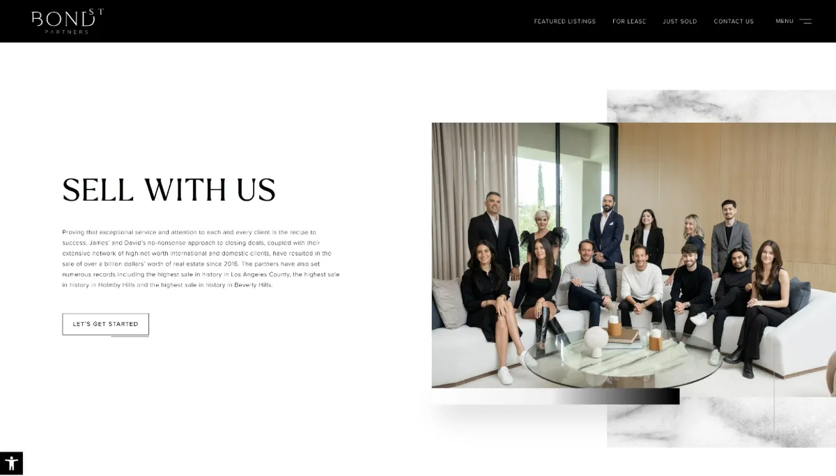
Why it’s so effective: More elegant than trendy, this landing page leverages a simple, direct headline “sell with us” with creative CTA button copy: “Let’s get started.” Instead of empathizing with the seller’s pain points, they include a team photo in a bite-the-back-of-your-hand beautiful listing. The message is clear — these are sophisticated professionals who sell high-end homes.
Key takeaways:
- Add your headshot: Adding a headshot or team photo reminds sellers that there is a friendly, empathetic human behind the page
- Use copy that’s creative, but not TOO creative: As a general rule of thumb, if you use creative copy for your headline, use more traditional copy in your CTA button.
- Highlight your smiling face, not the CTA button: The CTA button is barely noticeable. Your eye is immediately drawn to the well-dressed agents.
Hudson Advisory

Why it’s so effective: This page uses a more general headline that keeps the door open for inquiries from developers or even high-end renters. The agent’s picture exudes a casual elegance — they’re wearing T-shirts! — that lets the jaw-dropping architecture of their listing in the background do the talking.
Key takeaways:
- Highlight your smiling face, not the CTA button: The CTA button is the same color as the background. The focus is on the agents and the architecture.
- Use a creative headline: “Real estate advisor” sounds way more important (and useful) than “agent” or “broker”.
- Be thoughtful: The inclusion of “best time to call” radio buttons shows leads they are sensitive to the busy schedules of their clients
Home valuation landing pages
Home valuation landing pages are an excellent way to connect with homeowners still in the curiosity stage of selling their homes. They provide a simple but compelling offer: an expert opinion of their home’s value that’s more accurate than a Zestimate. Once you have their contact information, an in-person home valuation is an easy upsell.
These examples use simple but highly effective UX and copywriting strategies to increase conversions and generate more leads.
The Caul Group
Why it’s so effective: This elegant home valuation page from a luxury brokerage offers homeowners two options to find out how much their home is worth. They can choose between an in-person or an instant home valuation. While conversion data show instant home valuations are far more popular, allowing homeowners to book an appointment is never a bad idea.
Key takeaways:
- Make it easy: Both the instant and in-person home valuation pages explain precisely how long the process will take in “3 simple steps.”
- Use on-brand design: Simple, clean and elegant design is on-brand for a luxury team.
- Use visual time cues: The in-person valuation page includes visual cues to show where the lead is in the process.
- Give them a way to call you: The click-to-call button gives leads a chance to call the agent at any time
Jody Clegg Team

Why it’s so effective: Instead of the hard sell, this page focuses on educating sellers with friendly videos that include clear calls to action. This personal approach helps her team stand out in a sea of anonymous home valuation pages. Who would you rather get your home value from?
Key takeaways:
- Include videos: Videos are an excellent way to ease your seller’s concerns about working with a pushy agent. Make sure they’re friendly, informative and short.
- Address objections: The copy below the fold addresses common objections and highlights the value of an expert home valuation.
- Give them a way to call you: Leads can use the click-to-call button or the schedule-a-call link.
Anchor Real Estate Advisors

Why it’s so effective: This landing page boasts clean and simple design to highlight the call-to-action and uses clever copywriting techniques to increase conversions. The benefits of signing up are displayed above the fold — giving tire kickers an easy justification for signing up.
Key takeaways:
- Know your leads: The copy below the headline cleverly mentions that people can use their elevations to find out how much a neighbor’s home is worth. This is a common reason people use home valuations that some leads might not have thought of.
- Use friendly copy: “Stay in the know” provides readers with a tiny bit of FOMO or fear of missing out.
- Tell them exactly how long the process will take: “Gain insights in 30 seconds.”
- Include deal sweeteners above the fold: The inclusion of recently sold listings and market updates shows leads they will get more value than a simple home valuation.
Cash offer landing pages
Cash offer landing pages are all about Benjamins. Sellers considering cash offers only want to know two things: How much you can give them for their home, and how much stress you can remove from the selling process. This page does both masterfully:
Chris Lindhal

Why it’s so effective: This cash offer landing page uses ruthlessly simple and empathetic copy to convince people to sign up. The headline is clear, and the subheadline hits the pain points of selling a home in just nine words. Below, they present their solution to those pain points with just three words: Easy. Fast. Profitable. Social proof is cleverly placed right next to the lead capture form — exactly where most people will have second thoughts about giving away their contact information!
Key takeaways:
- Include social proof: Including Zillow and Google ratings above the fold reassures skeptical homeowners that this broker is trustworthy and competent.
- Highlight benefits, not features: The copy focuses on the benefits — easy, fast, and profitable — that a homeowner will get with a cash offer.
- Emotionally resonant images: Instead of a stock photo of a home, this page features happy, smiling children. The message is: “If you work with us, your children will be happy.”
Buyer lead landing pages
Buyer-lead landing pages are a trickier beast. You’re not just competing with other agents; you’re competing with portals like Zillow and Realtor.com. Focus on personalized, friendly copy that emphasizes your personal brand to keep them hooked. Here’s a deceptively simple yet effective example:
Shore Living

Why it’s so effective: Combining personalization (“Buy With Julie”), elegant design and creative copy is a surefire recipe for high conversion rates. The centered copy and CTA button create a pleasing visual hierarchy that encourages leads to click on the button. The “LETS TALK” button on the top right gives leads who just want to talk to an agent an easy way to do it.
Key takeaways:
- Use a creative headline: “Buy With Julie” and “Unlock The Door To Your Dream Home” emphasize the excitement many buyers feel about finding a new home.
- Use design that reflects your personal brand: The genteel script and serif fonts and the stately (but not too stately) home in the background are on-brand
- Keep it simple: there are only ten words on the page and every single one of them has a purpose — to convert the visitor into a lead.
Related articles

6 best real estate lead generation websites for 2024

8 best website builders for real estate agents, brokers and brokerages

The 9 top real estate lead generation companies for 2024
7 expert tips for high-converting real estate landing pages
Now that you have some inspiration from high-converting landing pages, here are seven expert tips for building your own
1. Write a clear + emotionally compelling headline
Effective headlines must be clear enough to reassure people they are in the right place and emotionally compelling enough to convince them to stick around. Consider these two headlines:
Sell With Us
OR
Buy With Julie
Unlock the Door to Your Dream Home
While both are clear, the second headline is far more emotionally compelling. Which one makes you want to keep reading? Which makes you feel more confident that the agent is likable, trustworthy and competent? The second headline has only seven more words, but the difference is everything. Who would you rather work with?
2. Make a personal connection with a lifestyle headshot
While the jury is still out on whether videos increase conversions, a friendly, professional lifestyle headshot can make your conversions skyrocket. People want to work with other people, not brands. They skipped the Zestimate and ended up on your home valuation page, right? Hammer home that you are a living, breathing, empathetic human on your landing page, and your conversion rate will soar.
3. Empathize with pain points, then offer a solution
As a Realtor, your main job is to help people. Before they even think about letting you help, they need to know you understand their problem. That’s why empathizing with your lead’s problems is one of the most common and effective copywriting techniques. Follow up with a solution (and the benefits of that solution), and your phone will never stop ringing.
The cash offer landing page above does this masterfully:
Pain points: No staging. No cleaning. No showings. No open houses.
Solution + benefits: Guaranteed offer. Easy. Fast. Profitable.
Note how the solution and benefits are just five words but still pack an emotional punch. Who doesn’t want their home sale to be easy, fast, and profitable?
4. Make it easy — don’t make me think!
The first rule of effective UX design for landing pages is “Don’t make me think.” If your visitor has to think about what you’re trying to say or what you want them to do next, you’ve already lost. If they’ve even dreamed about buying or selling a home, they are inundated with ads, calls, and offers from other agents. Why not make it easy for them?
Here are a few ways to make it easy:
- Add visual cues to tell them how long the process will take: Step 1, Step 2, Step 3
- Tell them how long the process will take: “In 3 easy steps” or “in 30 seconds.”
- Keep above-the-fold copy short and sweet
- Make the CTA button the most prominent element on the page
- Keep lead capture forms short: Name, email, phone number
- Fade background images to make your copy easier to read
5. Personalize your CTAs
After your headline, your CTA is the most important element on your landing page. If they don’t click, you don’t get a lead. It’s that simple. Want to squeeze a few more leads from your CTAs each month? Data show that personalized CTAs have 202% higher conversion rates than dull CTAs like “click here” or “send.”
Here are a few examples:
- Start your journey
- Let’s talk
- Let’s get started
- List my home
Just don’t get TOO personal. Remember the golden rule of copywriting: clear > clever.
6. Include social proof
While most people who end up on your landing pages are at least somewhat interested in your offer, many more have doubts. Including social proof with testimonials and Zillow reviews will put them at ease and make them more likely to give you their (actual!) phone number. Think of it like objection handling with words and graphics instead of on the phone.
7. Include a “call now” button
While most agents understand the value of a “call now” button on their website, we’re always shocked when they skip them on their landing pages. Think of how many boomers sitting on a Mount Everest of equity might want to pick up the phone and call you instead of filling out a form. Why not make it easy for them with a big fat button that lets them call you directly?
Real estate landing pages: The full picture
Landing pages are crucial tools for converting online traffic into qualified leads and achieving a better ROI from paid leads. Focus on clear and emotionally compelling copy, personalize your CTAs, add a dash of social proof, use clean design and watch your conversion rate soar.
Related articles


Categories
Recent Posts